Show the code
ggplot(hand_washing, aes(x = Method, y = Bacterial_Counts)) +
    geom_boxplot() +
    geom_beeswarm(aes(color = Method)) +
    theme_vs() + theme(legend.position = 'none')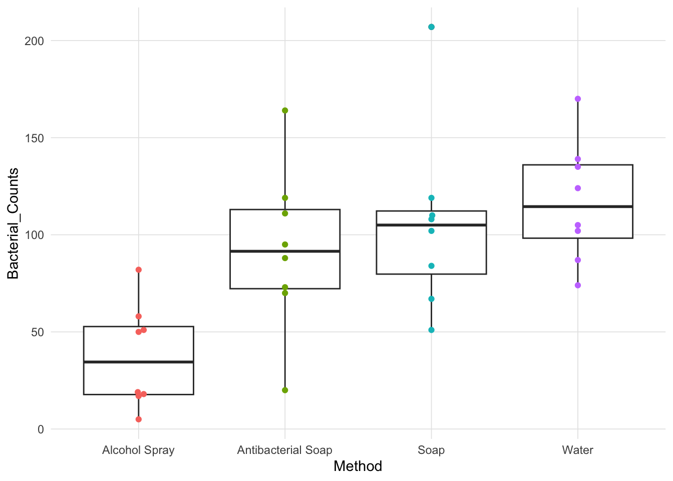
Analysis of variance (ANOVA) remains an important statistical method for a variety of situations. ANOVA is typically taught along with other null hypothesis tests (e.g. t-test, chi-squared), however, there are many nuances differences in how the test statistic is calculated that many students do not fully understand. Specifically, why use the ratio of mean square between (or treatment) and mean square within (or error) as the test statistic? Pruzek and Helmreich (2010) introduced a visualization that attempts visualize all the components of ANOVA. This visualization was implemented in the granova (2014) R package utilizing the base graphics system. This document introduces a version of the granova visualization usinge ggplot2 Wickham (2016) that provides a number parameters to isoloate certain features of their visualization. We use this approach in teaching ANOVA, mostly through the use of Shiny (Chang et al, 2021) that allows the user/students to interactively add and remove plot features.
To exemplify this appraoch we will explore the effects of different approaches of hand-washing has on bacteria counts (De Veaux et al, 2009). Specifically, each of four types of hand-washing (alcohol spray, antibacterial soap, regular soap, and water only) were replicated eight times resulting in 32 observations. The boxplot below provides a summary of the data.

When conceptualizing variances graphically, we wish to draw squares. Consider the formula for the sample variance:
\[s^2 = \frac{\sum(x_i - \bar{x})^2}{n - 1}\]
If we focus on the numerator for a singe observation, say \(i = 1\), \((x_1 - \bar{x})^2\), the contribution to the variance calculation for the first observation can be conceptualized as a square with edges of length \(x_i - \bar{x}\). Therefore, the sample variance (which we can also call mean square total - which ignores group membership) is approximately the average of the area of all those squares (see the figure below). NOTE: It is approximate because the sample variance has \(n-1\) in the denominator. The true average, using the population variances, would have \(n\) in the denominator. This visualization of squares sets up delineation of the visualization of components of ANOVA.
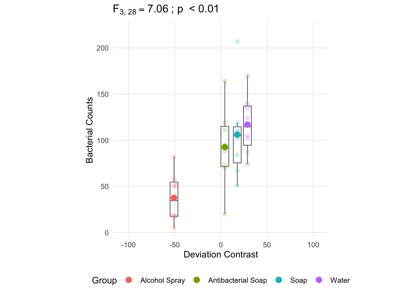
In order to use squares to represent the partitioned variance components in ANOVA, it is convenient to derive the deviation of each group mean from the grand mean. This aligns with using “effect coding” to code for group membership in linear modeling. Some times this kind of coding is labeled “deviation coding”. These deviations form a type of contrast and we can visualize one for each group. Consider the summary statistics for each group.
# A tibble: 4 × 15
   item group1      n  mean    sd median trimmed   mad   min   max range    skew
  <int> <chr>   <int> <dbl> <dbl>  <dbl>   <dbl> <dbl> <dbl> <dbl> <dbl>   <dbl>
1     1 Alcoho…     8  37.5  26.6   34.5    37.5  25.2     5    82    77  0.297
2     2 Antiba…     8  92.5  42.0   91.5    92.5  30.4    20   164   144 -0.0161
3     3 Soap        8 106    47.0  105     106    25.9    51   207   156  0.961
4     4 Water       8 117    31.1  114.    117    33.4    74   170    96  0.224
# ℹ 3 more variables: kurtosis <dbl>, se <dbl>, IQR <dbl>
The mean of the dependent variable is 88.25. If we subtract this value from each group mean, then the deviance in the x-axis will be proportional to each groups deviance from the grand mean.
The following figure plots the dependent variable (bacterial counts) in the y-axis and each group is located at a position on the x-axis defined by the deviation for that group mean (the deviations must sum to zero).
anova_vis(Y = hand_washing$Bacterial_Counts,
          group = hand_washing$Method,
          plot_boxplot = TRUE,
          plot_group_variances = FALSE,
          plot_group_sd = FALSE,
          plot_ms_within = FALSE,
          plot_ms_between = FALSE,
          plot_unit_line = FALSE,
          plot_grand_mean = FALSE,
          plot_sd_line = FALSE,
          plot_pooled_sd = FALSE,
          plot_between_group_variances = FALSE,
          ylab = 'Bacterial Counts'
)
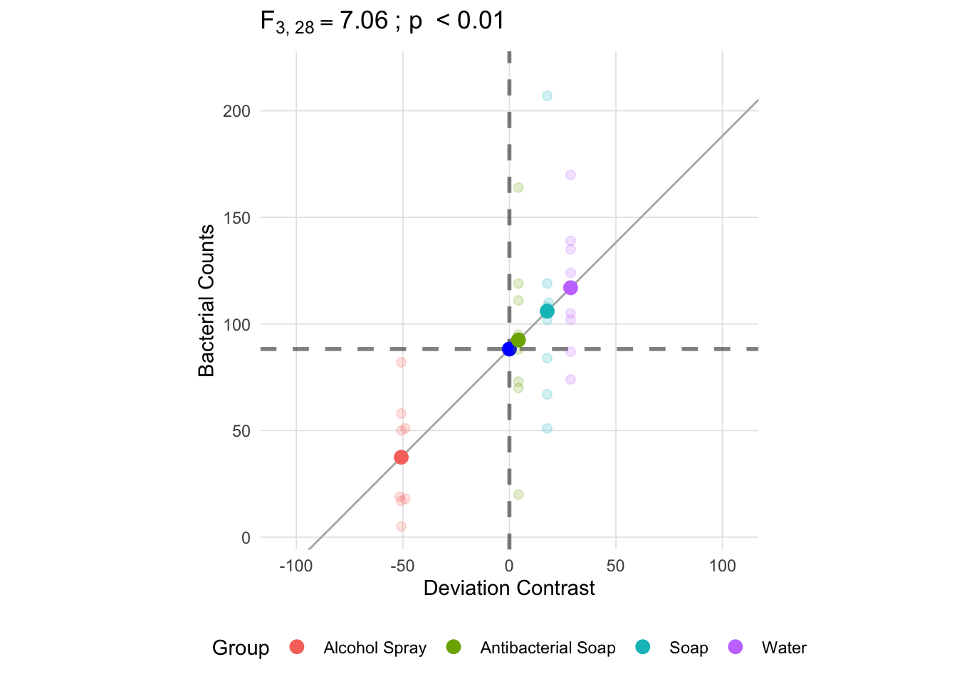
An important advantage of using deviation contrasts is that a one unit change in the x-axis is the same as a one unit change in the y-axis. We can verify this by adding the unit line (i.e. \(y = x\)) to the plot and see that the line intersects mean of each group. We also added the grand, overall, mean in both the x and y-axes. The dashed lines represent the grand mean in two ways: 1. raw scale grand mean in the y-axis and 2. the deviation scale in the x-axis.1
anova_vis(Y = hand_washing$Bacterial_Counts,
          group = hand_washing$Method,
          plot_boxplot = FALSE,
          plot_group_variances = FALSE,
          plot_group_sd = FALSE,
          plot_ms_within = FALSE,
          plot_ms_between = FALSE,
          plot_unit_line = TRUE,
          plot_grand_mean = TRUE,
          plot_sd_line = FALSE,
          plot_pooled_sd = FALSE,
          plot_between_group_variances = FALSE,
          ylab = 'Bacterial Counts'
)
The following table has the formulas for each component of an ANOVA summary table.
| Source | Sum of Squares | df | MS | F | p |
|---|---|---|---|---|---|
| Between Group (Treatment) | \(\sum^{}_{k} n_{k}(\bar{x}_{k} -\bar{x} )^{2}\) | \(k - 1\) | \(\frac{SS_{between}}{df_{between}}\) | \(\frac{MS_{between}}{MS_{within}}\) | area to right of \(F_{k-1,n-k}\) |
| Within Group (Error) | \(\sum^{}_{k} \sum^{}_{i} (\bar{x}_{ik} -\bar{x}_{k} )^{2}\) | \(n - k\) | \(\frac{SS_{within}}{df_{within}}\) | ||
| Total | \(\sum^{}_{k} \sum^{}_{i} (\bar{x}_{ik} -\bar{x} )^{2}\) | \(n - 1\) |
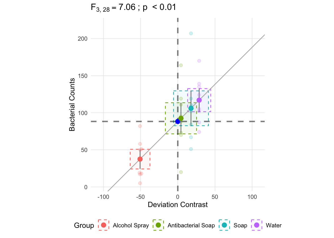
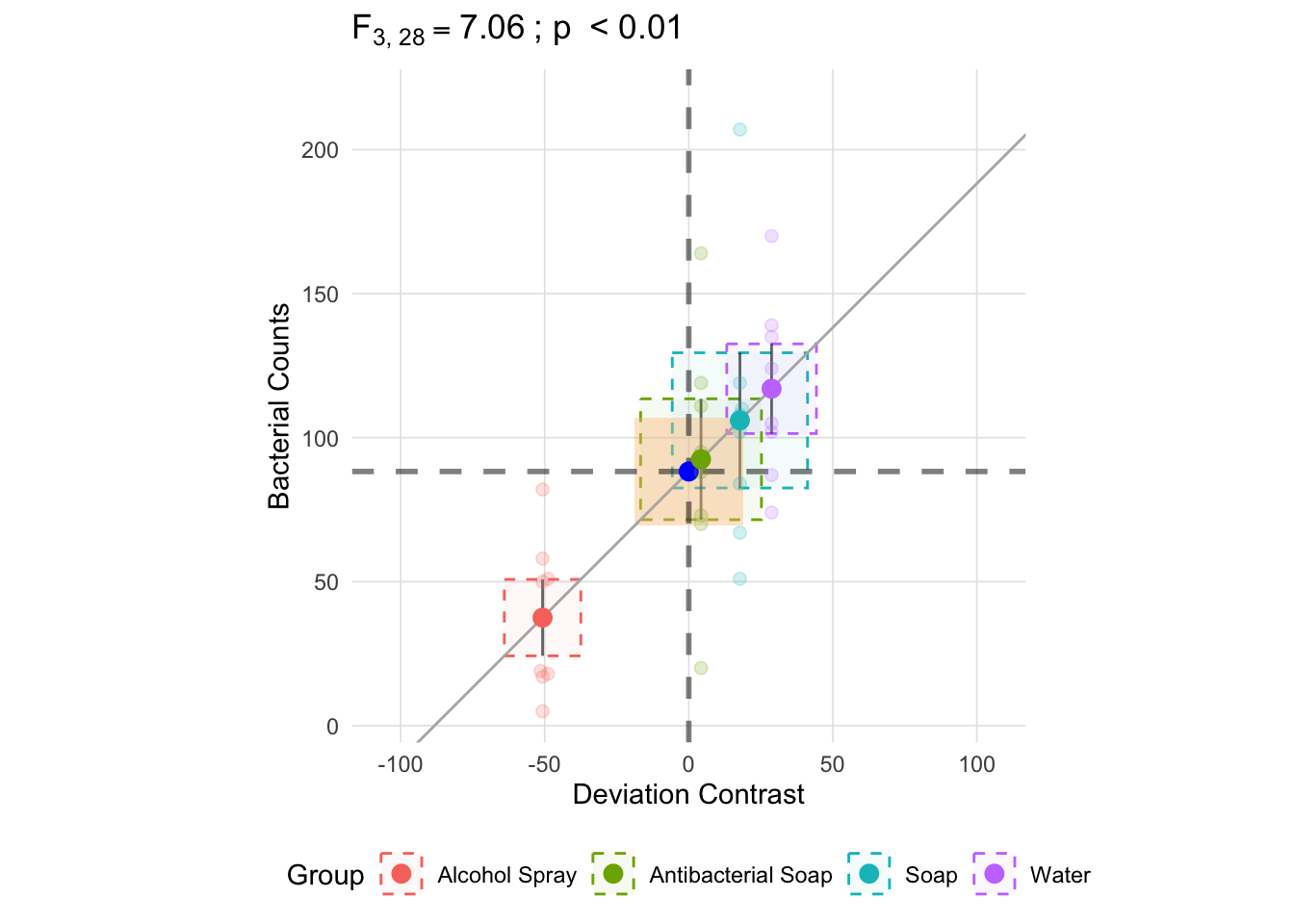
With k being each group and i the observation within group k, the calculation for the within group component involves calculating the deviance from the group mean. In the figure below, the vertical line for each group represents one standard deviation and the area of the box is the variance (\(s^2\); recall that the standard deviation is equal the square root of the variance).
anova_vis(Y = hand_washing$Bacterial_Counts,
          group = hand_washing$Method,
          plot_boxplot = FALSE,
          plot_group_variances = TRUE,
          plot_group_sd = TRUE,
          plot_ms_within = FALSE,
          plot_ms_between = FALSE,
          plot_unit_line = TRUE,
          plot_grand_mean = TRUE,
          plot_sd_line = FALSE,
          plot_pooled_sd = FALSE,
          plot_between_group_variances = FALSE,
          ylab = 'Bacterial Counts'
)
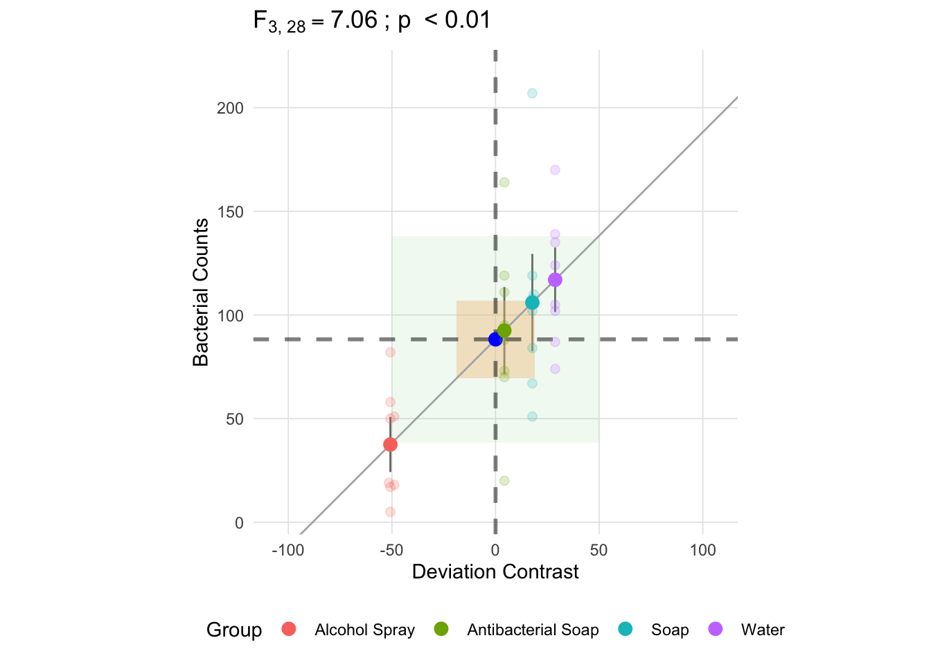
The mean square within is approximately the average of each groups variances and is represented below as the orange square in the center. Like the variance estimate above, becasue the denominator is \(k - 1\) the mean square within will be slightly larger than if we used \(k\) in the denominator. By using \(k - 1\) we get an unbiased estimate.2
anova_vis(Y = hand_washing$Bacterial_Counts,
          group = hand_washing$Method,
          plot_boxplot = FALSE,
          plot_group_variances = TRUE,
          plot_group_sd = TRUE,
          plot_ms_within = TRUE,
          plot_ms_between = FALSE,
          plot_unit_line = TRUE,
          plot_grand_mean = TRUE,
          plot_sd_line = FALSE,
          plot_pooled_sd = FALSE,
          plot_between_group_variances = FALSE,
          ylab = 'Bacterial Counts'
)
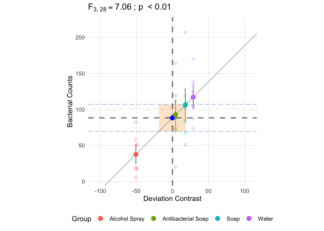
Since we have equal group sizes, the pooled standard deviation (here represented by the horizontal dashed blue lines) is approximately to the square root of the mean square between (the difference in these is due to the using the degrees of freedom in the denominator instead of n). This will not necessarily be the case when the group sizes are not equal since we are taking a weighted average (note the *\(n_k\) in the formula for the sum of squares between).
anova_vis(Y = hand_washing$Bacterial_Counts,
          group = hand_washing$Method,
          plot_boxplot = FALSE,
          plot_group_variances = FALSE,
          plot_group_sd = TRUE,
          plot_ms_within = TRUE,
          plot_ms_between = FALSE,
          plot_unit_line = TRUE,
          plot_grand_mean = TRUE,
          plot_sd_line = FALSE,
          plot_pooled_sd = TRUE,
          plot_between_group_variances = FALSE,
          ylab = 'Bacterial Counts'
)
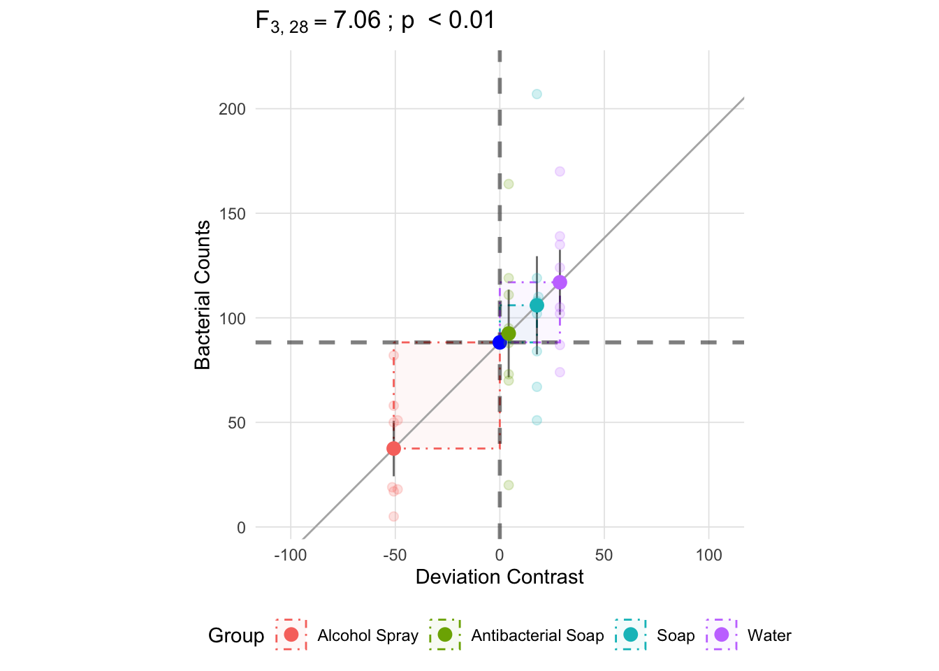
There are two ways to approach the between group (treatment): 1. Since we know the total sum of squares and the within group sum of squares, we can subtract the within group sum of squares from the total to get the between group sum of squares, or 2. Perform the calculation as presented in the table above. Looking at the fomrula, we see that the between group sum of squares is centered on each group mean’s deviance from the grand mean: \((\bar{x}_k - \bar{x})^2\) (note that \(\bar{x}_k\) is the group mean and \(\bar{x}\) is the grand mean). The figure below depicts these deviances.
anova_vis(Y = hand_washing$Bacterial_Counts,
          group = hand_washing$Method,
          plot_boxplot = FALSE,
          plot_group_variances = FALSE,
          plot_group_sd = TRUE,
          plot_ms_within = FALSE,
          plot_ms_between = FALSE,
          plot_unit_line = TRUE,
          plot_grand_mean = TRUE,
          plot_sd_line = FALSE,
          plot_pooled_sd = FALSE,
          plot_between_group_variances = TRUE,
          ylab = 'Bacterial Counts'
)
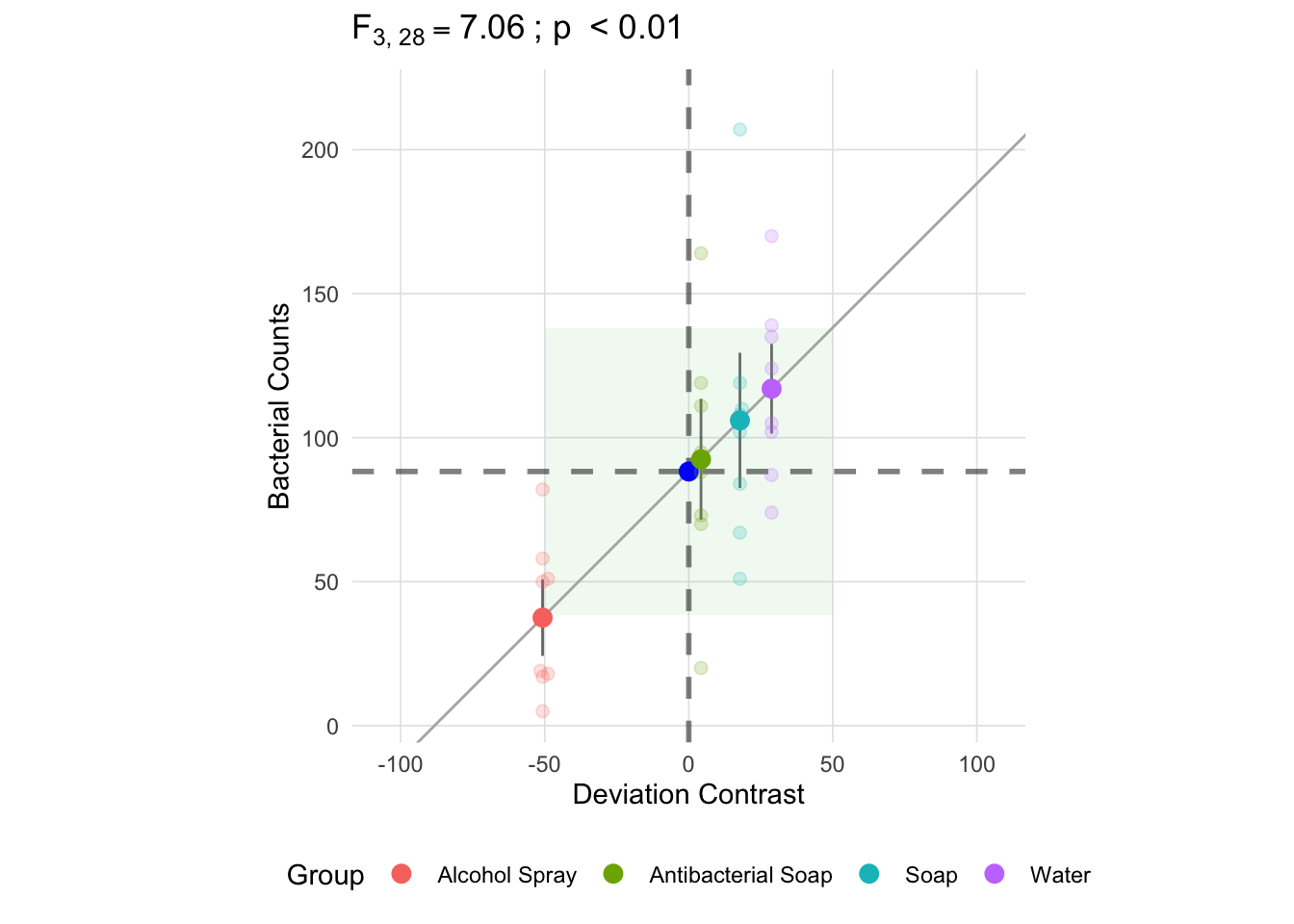
Unlike the within group sum of squares, each deviance is multiplied by the group size, \(n_k\). Since we have equal group sizes in this example, they will each contribute equally to the total between group sum of squares, though it should be noted that this is not case with unequal group sizes. As a result, the mean square between is not an average of the deviances, but rather the sum of the deviances multiplied by \(\frac{n_k}{k - 1}\) (in this example it is \(\frac{8}{3}\)). The resulting mean square between, depicted below as the green square, is going to be larger than all the individual components of the sum of squares.
anova_vis(Y = hand_washing$Bacterial_Counts,
          group = hand_washing$Method,
          plot_boxplot = FALSE,
          plot_group_variances = FALSE,
          plot_group_sd = TRUE,
          plot_ms_within = FALSE,
          plot_ms_between = TRUE,
          plot_unit_line = TRUE,
          plot_grand_mean = TRUE,
          plot_sd_line = FALSE,
          plot_pooled_sd = FALSE,
          plot_between_group_variances = FALSE,
          ylab = 'Bacterial Counts'
)
Now that we have a square representing both the mean square between (in green) and the mean square within (in yellow), the F-statistic is equal to the ratio of the area of these two squares.
anova_vis(Y = hand_washing$Bacterial_Counts,
          group = hand_washing$Method,
          plot_boxplot = FALSE,
          plot_group_variances = FALSE,
          plot_group_sd = TRUE,
          plot_ms_within = TRUE,
          plot_ms_between = TRUE,
          plot_unit_line = TRUE,
          plot_grand_mean = TRUE,
          plot_sd_line = FALSE,
          plot_pooled_sd = FALSE,
          plot_between_group_variances = FALSE,
          ylab = 'Bacterial Counts'
)
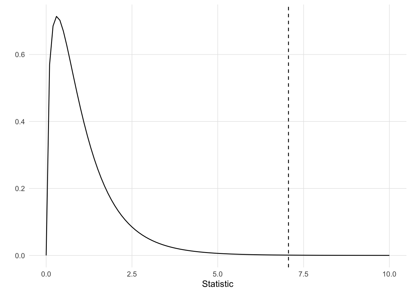
The p-value is the area under the F-distribution to the right of the F-statistic (repsrented as a vertical dashed line below).
This Shiny application can be run locally using the VisualStats::anova_shiny() function.